(Cross-posted from http://evilbrainjono.net)

I wrote a Thunderbird add-on to make the email interface I’ve always wanted — one that helps me remember to stay in touch with people I really care about, instead of always distracting me with the newest incoming trivia.

The add-on is called Lovebird and you can download it here.

lovebird screenshot (with fake names)

the names in this screenshot have been changed to protect the innocent

The rest of this post is about the philosophy behind Lovebird and why I designed it the way I did.

(more…)

The way the “reply-all” button works in Thunderbird is noticably worse than the way it works in GMail.

The difference might seem trivial, but the GMail version saves me a lot of aggravation, because the following scenario happens at least twice a day:

I hit “reply” and start writing an email. A few sentences in, I discover that the message I’m writing applies to all the people in the original thread, not just the sender. I want to change my “reply” to a “reply all”.

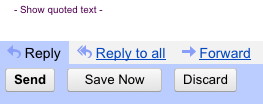
In GMail if I hit “reply all”, it does the right thing: adds the addresses of the other people on the thread to my composition already in progress.

Screenshot of reply-all button in GMail

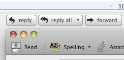
In Thunderbird (as of version 7.0.1), the Reply and Reply All buttons spawn new windows. If I switch from a “Reply” composition window back to the main window and hit “Reply All”, I get a brand-new composition window. To save what I’ve already written, I have to copy-paste my words from the original window to the new one, then close the first window.

Screenshot of Thunderbird's reply-all button

It’s just a few extra steps, but it’s annoying in a way that disrupts my train of thought, which should be focused on the content of my writing, not the mechanics of sending it.

It would be nice to get the GMail reply-all behavior in Thunderbird. But it would be even nicer if designers everywhere could more consistently embrace the design principle behind the GMail reply-all button. That principle is:

Let me change my mind without having to start over.

We need to recognize that humans change their minds about what they want all the time. If I’m on Step Four and I realize I should have gone right instead of left at Step One, I should not have to re-enter the same information for Steps Two and Three. And yet too many interfaces (I’m thinking multi-stage web forms, “setup wizards”, and the like) still force users to make decisions in an arbitrary sequence dictated by the implementation details of the code.

Doing it right is more work for the programmer, of course. The implementation must be more complex. You can't simplify by throwing away data related to paths not immediately taken. But respecting the reality that users change their minds is more important than cutting corners in your code.

Hey, Game On 2010 contest participants — how are those HTML 5 games coming along? I can’t wait for January 2010 when I can finally see what you’ve made.

I’ve been doing some HTML 5 experimentation of my own. What I’m working on is not a game, but it is a graphical HTML 5 webapp that uses several tricks that may be of interest to game developers. It’s easier to show it in action than to tell you about it, so watch this video (hosted on Vimeo since WordPress won’t let me embed) for a preview of Pencilbox and an explanation of how it works.

Note: this is not a Mozilla project — this is a personal project I’ve been hacking on in my free time.

I’m not yet ready to put the app itself on a public webserver where you can play with it, nor have I set up a public code repository yet. (Like I said, it’s a side project, so I haven’t had time to work on the infrastructure stuff.) When I do have it set up properly, I’ll let you know. In the meantime, here’s a tarball of the source code, which is under a Mozilla tri-license. It may be of some interest if you wish to achieve a similar effect in your Game On 2010 submission and you want to see how I did it.

Happy hacking!

I’ve been learning to play the accordion.

The process of learning the accordion has illustrated to me, viscerally, what usability researchers have been saying for years: Humans can’t actually multitask. If you think you’re multitasking, either:

  • You’re rapidly switching between two things, and doing both of them poorly
  • You’re doing one activity during the inherent downtime parts of another activity
  • One activity has become so automatic that you can do it without conscious thought, freeing you to focus on the other activity

When you’re playing the accordion, your left hand is pushing buttons to play the chords of the song and keep time, while your right hand plays the main melody on a piano keyboard. They’re playing different parts and using different interfaces to do it. There’s also a third activity, the alternate squeezing and pulling motions needed to keep air flowing through the reeds; the moment you stop doing that, the sound stops as well.

The squeezing and pulling soon became automatic; I don’t even think about that anymore.

My biggest trouble is doing the left-hand and right-hand parts at the same time. As soon as I look at a new musical score, I can fairly easily play just the left-hand part, or just the right-hand part. One activity with full conscious attention. But getting the two parts to happen together takes hours of intense practice per song. Each part demands my full conscious attention, but I am neurologically incapable of doing that. It’s like trying to run through a wall.

A way around the wall is to learn one of the two parts (usually the chords) so well that I can do it automatically, without thinking, and focus my conscious mind on the other part.

The other way around the wall is to “chunk” segments of both parts together. For example, a certain song might have the left hand playing eighth notes of G, G-minor each time the right hand plays a B-flat quarter note. I can learn that as a single chunk and then perform the song as a sequence of chunks. This essentially turns a multitasking operation into a single-tasking operation with more difficult pieces.

I’m willing to put in all this effort because music is a fun hobby and I like the way it sounds when I finally get the two hands playing together. Whereas learning a software interface (other than a game) is nobody’s idea of a fun hobby, and is generally something that people want to get over with as soon as possible so they can focus their entire conscious mind on creating their content or otherwise doing their work.

Of course, your software is a shining beacon of usability that would never require users to multitask… or would it? Does your interface ever, for instance, require users to remember some important piece of information while also navigating a maze of menus and dialog boxes? To you, that navigation may be something you can do automatically, unconsciously, leaving your conscious mind focused on the important stuff. But to users who haven’t yet memorized the chords, so to speak, that navigation still requires conscious thought, and might force the melody right out of their head.

Alexander Limi has posted a video, from the Design Lunch three weeks ago, wherein the UX leads answered questions about their provisional redesign of the Firefox UI.

Alex wants to warn you that the contents of this video are very rough, very much a work-in-progress, and very much liable to change. You shouldn’t watch it thinking "this is how the next version of Firefox is definitely going to be". You should think of it as a behind-the-scenes look at "how the sausage gets made", in Alex’s words. He also warns:

There’s swearing, there’s mumbling, there’s ranting, there’s hand-waving, there’s political incorrectness.

I’m also in the video, playing MC in my overalls.

Today we recorded Part 2, which goes into detail about the notifications interface and the downloads manager; it should be posted fairly soon.

What would the web be like if you could tell it what you want to do as easily as you currently tell it where you want to go?

Mozilla Labs is starting to experiment with linguistic interfaces. That is, we’re playing around with interfaces where you type commands and stuff happens — in much the same way that you can type a location into the address bar in order to go somewhere.

I think this is cool because, for one thing, I think language-based interfaces are seriously under-explored compared to pointing-based interfaces. For another thing, I used to work on a project called Enso. Enso’s a language-based interface, where you type commands in and stuff happens. I think we got certain things right and certain things wrong in Enso’s UI design, so I want to take another crack at doing it better.

What makes a good linguistic UI?

Here’s my current theory.

  1. It’s easy to learn.
  2. It’s efficient.
  3. It’s expressive.

Those are the three “E”s. Let’s unpack ’em a little.

(more…)

These things I believe about software development and user-interface design.

1. Why write code?

Software is for humans, not for computers.

Software is only as good as the improvement it makes to a human being’s life.

Are we making someone’s job easier? Letting them have more fun? Helping them learn? Helping them keep in touch with friends and family?

Are we making the world a better place?


2. What do people want?

Most people do not want a computer.

They don’t even want software.

For us software developers, this is a painful truth.

If people don’t want a computer, why do they use one?

  • Email — for writing to other people.
  • Instant messaging — for talking to other people.
  • The web browser — for reading what other people have written.
  • Word processing — for writing something you’re going to print out and show to other people.
  • Graphics — for creating artwork. To show to other people.
  • Presentation — for communicating your brilliant plan. To other people.
  • Games — especially games that you can play online. With other people.
  • Social networking websites — Enough said.

The computer is merely an intermediary. A poor and frustrating one. It is a necessary evil that people put up with in order to get what they want.

What they want is a better way to talk to each other.


3. Why does software succeed or fail?

We software developers, being not exactly social creatures by nature, must work extra hard to understand the social impact our software will have. If the social effect is not what people want, the software goes unused.

We software developers, being not exactly average users, must work extra hard to understand how average users will relate to our software. We see the trees, they see the forest.

We software developers have often been confused and frustrated when a clearly superior technology fails, while a clearly inferior technology spreads like wildfire and takes over the world.

We were surprised because we want each technology to be judged only by its cleverness, its raw power, the cleanliness of its architecture, the purity of its ideas. We were blind to the user experience, to what each technology meant in the bigger picture of a person’s life.

To the people buying and using the “clearly inferior” technology, exactly the opposite was true.

To the user, the interface is the product.


4. Why is there not more Linux on the desktop?

For open source software to take over the world, we’re going to have to do a lot better at user interfaces than we have been doing.

How do I know?

Open source has already taken over the invisible parts of the world: the servers, the infrastructure, the things users need not touch directly.

Mozilla, the most user-experience-focused of open-source companies, has the most adoption by end-users.

People say things to me like, “Linux is only free if the value of my time is zero.”

These are not coincidences.

At one time, the way of open-source software development was thought impossible. But the techniques were invented. The way became possible; then it became successful. Now the techniques are becoming widely known.

The way to make open-source UI design successful is still unclear. We must invent the techniques.


5. Are users dumb?

User interface design is not about dumbing things down for the poor stupid user.

We software developers, understanding the software as we do, find it easy to look down upon those who lack our understanding.

This is wrong.

Users aren’t dumb. They just have better things to do with their lives than memorizing the internal data model of our screwy software.

When software is hard to use, don’t make excuses for it. Improve it.

When a user makes a mistake, don’t blame the user. Ask how the software misled them. Then fix it.

The user’s time is more valuable than ours. Respect it.

Good UI design is humble.


6. Is UI design marketing?

User interface design is not marketing.

Software developers loathe marketing, so if they think that UI design is marketing, then they will loathe UI design.

The qualities of software that make for a good advertisement or computer-store demo are not the same qualities that make software usable and pleasant to work with long-term, day-in day-out. Often these qualities are opposites.

A shopper may choose the microwave with more buttons, because it seems “more powerful”. However, the shopper will soon find out that it does the same thing as any other microwave, you just have to spend longer figuring out which button to push.

It is easy to fool people into buying something that is against their own best interest.

Don’t do that.


7. What is the task of the UI designer?

Let us talk about that microwave some more.

The microwave with the most buttons may be most popular, but it is not the best microwave.

The best microwave has no buttons at all.

It doesn’t need any buttons because it already knows how long you want your food cooked and how hot. You never need to set the clock, either: it’s just always right.

The no-button microwave may not be reachable, but like a guiding star it shows us the direction we should travel.

Users do not know what interface they want. Users do not know what features they want.

Users know the tasks they want to do, and the problems they have.

We learn more by watching the user work than by asking the user.

The job of the UI designer is to provide what the users need, not what the users say they need.

It is to make tasks easier, not to provide features.


8. Where is the science?

User interface design can be approached scientifically. But usually isn’t.

Until we observe people using our software for real, our design is guesswork and superstition.

These things can be measured and given numbers:

  • What program features are being used most frequently, and least.
  • The number of mouse/keyboard interactions required to perform a task.
  • The time it takes a user to figure out how to do a task.
  • Rates of error.
  • How quickly task-completion-time and error-frequency decrease as a user gains experience.

An interface’s efficiency and learnability are empirically determinable quantities.

They are not matters of opinion.

Every user is different, but that’s why we have statistical methods.

The science of design can tell us that interface foo is X% more efficient than interface bar, but bar is Y% more learnable than foo.

Choosing between foo and bar — that’s where the science ends and the art begins.


9. Is change good or bad?

Change has a cost. Change disrupts the user’s habits. Change forces the user to learn something new.

Sometimes the new UI is so much better than the old one that the change is worth the cost.

Sometimes it isn’t.

The trick is knowing when change is worth it.


10. What is the evil of the bad interface?

It is a sin to waste the user’s time, break the user’s train of thought, or lose the user’s work.

Bad user interfaces do all three. Frequently.

Most interfaces are bad.

I do not use the word “sin” lightly.

Because of bad user interfaces, an action taken based on a reasonable assumption or out of habit often results in broken trains of thought, wasted time, and lost work. This is called “user error”, but it isn’t. It is programmer or designer error.

When we blame the user, we teach them that technology is perfect and that the errors are their own. Because technology is hard to use, we are teaching a generation to be afraid of technology. We are teaching a generation to believe in their own stupidity. This is a sin, too.

It’s not the user’s fault.