It looks like Google has finally pulled the plug on the old GMail UI. There’s no more “revert to the old look temporarily” button, so I guess they’re finally forcing us laggards onto the new theme. I’ve been a mostly happy GMail user since the very early days, but I strongly dislike the new UI.

As far as i can tell, this redesign is just change for the sake of change. I can’t see a single improvement! But I can spot three distinct un-provements *:

(more…)

A modal dialog box is the software designer making a claim that the software cannot do anything else until the user makes a decision. Upon closer examination, this claim is almost never justified. It’s usually a case of developer arrogance: developers assuming that because they have to care about some edge case in the software control flow, the user should have to care about it too.

There’s a particularly egregious example in Thunderbird 7.0 which I’ve seen a lot of lately because I’ve been composing a lot of emails offline.

I’ll be on the train or something, happily offline, typing an email in Thunderbird for later sending, and suddenly I’m interrupted by this:

Modal dialog box asking whether to retry saving a draft

Email composition, interrupted. Train of thought, destroyed. Input window, blocked. I cannot continue until I’ve processed what the software is asking me and made a decision.

Alright, Thunderbird, what’s the problem? Oh, you couldn’t save my draft to my mail server? Gee, I wonder why. Maybe because I’m not connected to the internet. There’s no reason I would expect you to be able to save a draft right now.

The correct behavior would be for Thunderbird to keep checking, silently, for an internet connection, and to save the draft to the server as soon as a connection becomes available again. But there’s no button for that, so I click “Cancel”.

Warning message telling me that the draft could not be saved

Argh! Another one! What is it this time?

…An error message telling me my draft could not be saved. Thunderbird, I just told you to stop trying to save my draft. Why are you using an error message to report that you’re doing as I told you? That’s not an error, that’s the expected result of the button I just clicked. Why are you telling me anything at all? Why are you putting another dialog box in my way instead of just letting me get back to my email?

Jef Raskin used to call these “Monolog boxes” — they’re like dialog boxes except there’s no dialogue because the software isn’t asking me for any information. It’s just complaining to me and then making me click a button to acknowledge that I heard its complaint.

So that’s a modal dialog box followed by a modal monolog box just to tell me something I already knew, which is that I’m offline so of course drafts can’t be saved. And this pointless ritual recurs every ten minutes or so when Thunderbird tries to save my draft. If I’m composing multiple emails at the same time, I have to dismiss these pointless dialogs for every composition window!

The way to fix this interface is quite simple. There’s no reason to interrupt the user to report on the status of saving the draft. Thunderbird should allow me to keep typing my email while it displays a discreet warning message — off in the corner of the window, perhaps — to the effect of “This draft has not been backed up.” Even that much is arguably unnecessary, because the right thing to do in this case is obvious: back up the draft to my hard drive, and then sync it to my email server when an internet connection becomes available again. This can be done without any user input at all.

When the right thing to do is obvious, software should just quietly do it. It shouldn’t interrupt me to ask my permission or complain about problems.

BumpTop makes me sad.

BumpTop is a 3-d, physics-enabled desktop environment, where you can smack icons into each other like billiard balls, throw documents into messy piles, pin sticky notes to the walls, etc. “just like in a real desktop!”.

I’ve actually met a guy or two who worked on BumpTop, and they were good people who were obviously smart and hardworking, so I feel kind of bad dissing their software. But they missed something really obvious, which is that the “desktop” in GUIs is a zone of zero productivity. You don’t get work done there. You don’t receive useful information there or even play games there. It’s a place you go to launch an application if you can’t find it in your Dock or Start Menu, to search for a file if you can’t find it in the Open dialog box, or a place you go to manually rearrange your filesystem if you’re obsessive about that sort of thing. Interacting with the desktop is generally a last resort after other, faster methods of getting to your data have failed you. About the only useful thing you do there is copy files between disks.

Therefore, you want to minimize time spent on the desktop and maximize time spent in applications having fun or being productive. I believe the way to “improve” the desktop is to eliminate the need for it by making it easier to instantly access any of your data in any of your applications.

Dressing the desktop up with goofy animations and physics is completely beside the point. You can make it act more like a physical desktop, but why? The fact that my physical desk is covered with messy piles is a bug, not a feature. BumpTop is a case of taking a computer metaphor too literally, as well as a case of doing something just because you have the technology for it. It looks cool, but I have yet to hear anyone, even its creators, describe a single compelling advantage to using it. So it makes me sad that skilled programmers have put a lot of time into this thing.

Anyway, BumpTop has now been bought by Google, so good for them, I guess. There has been a lot of speculation that Google wants their expertise for developing some kind of multi-touch interface for Android phones or tablets. I wish those guys well and hope that their next project is something a little more practical.

After I found out what Google Buzz was doing, I turned it off as quickly as possible.

…or did I?

As if there weren’t already enough layers in this cake of failure, apparently the link at the bottom of GMail that said “Turn off Buzz” does not actually turn off Buzz – it removes the Buzz cruft from the GMail interface, but it leaves you in the network.

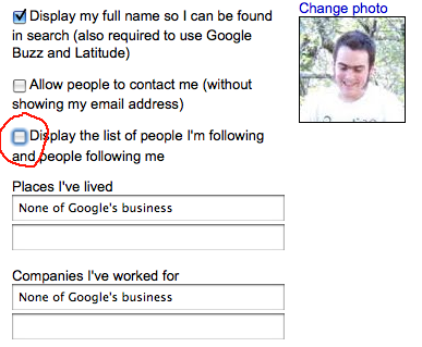
So in an attempt to really and truly escape from Buzz, I went to my Google profile page, where I found a checkbox (checked by default!) saying “Display the list of people I’m following and people following me”:

I unchecked that. Then I went to my GMail account, clicked on Settings, and found the same option again. There was also a link that said “Disable Google Buzz”, which sounded pretty good, so I clicked that too:

So now I should be completely out of the woods, right? To double-check, I went and took a look at the public Google profile of Aza, one of my friends who was actively using Buzz. And there I saw a message that said “Aza is following you”:

Aza is following me? So is Buzz really turned off or not? I’m still not sure what’s going on here.

[Edited to add]: Apparently I needed to turn Buzz back on so that I could go in and click “block” on each follower, one by one, until the list was empty, and then turn it off again.

The site ReadWriteWeb recently did an article called Facebook wants to be your one true login. The contents of this article are something I’ll address in another post. What I want to talk about today has nothing to do with the actual contents of the article, and everything to do with the fact that this article was for some period of time one of the highest hits on Google for the search “Facebook login”.

The comments thread on the article filled up with over a thousand comments from confused and frustrated people asking “Now how do I log in?” and “The new design sucks!”.

That’s right. These people had been relying on a Google search for “Facebook login” to get to the Facebook login page. When they ended up at ReadWriteWeb instead, they didn’t know that they were in the wrong place. They thought that the Facebook login page had changed, and they weren’t happy about it. ReadWriteWeb has now put up a gigantic disclaimer on the article to explain that they are not Facebook and explain how to get there.

This whole chain of events seems destined to go down in Internet history as an amazing pile-up of failure.

Reactions seem divided into two camps. One camp is having a great laugh at the stupidity of the users – after all, how could they look at a page with a red masthead, titled “ReadWriteWeb”, featuring a news article, and think they were on the Facebook login page? How could they be smart enough to figure out how to leave a comment, but too dumb to know what site they were on?

The other camp, for example an article from blogger Funkatron called We’re the stupid ones is pointing the finger at the software world for assuming that everyone knows as much about computers as we do, and more specifically at Google – after all, isn’t this in some way Google’s screw-up for returning the wrong result?

Well, the name of this blog is “Not the User’s Fault”, so much as I would like to have a laugh at stupidity and then move on, I think it’s better to try to understand what this must have been like from those users’ point of view, and see if there’s anything we can learn from the whole boondoggle.

(more…)

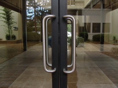
In the Mountain View building complex that houses the main Mozilla offices, there are many doors like this one.

In the Mountain View building complex that houses the main Mozilla offices, there are many doors like this one.

What's your natural reaction to a vertical door handle?  You grab it like this...

What's your natural reaction to a vertical door handle? You grab it like this...

...and pull it to open, right?

...and pull it to open, right?

But if the handle is on the inside of the door, then pulling does nothing.  EVERY SINGLE PERSON who I've seen encounter these doors has made this mistake.

But if you're on the inside of the door, then pulling does nothing. EVERY SINGLE PERSON who I've seen encounter these doors has made this mistake.

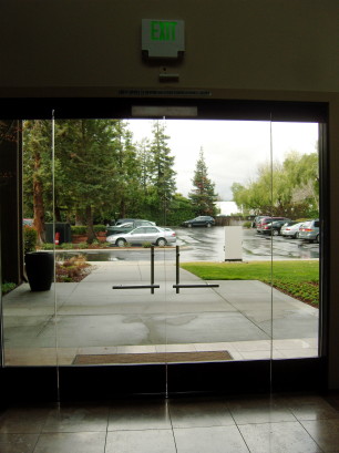
The other side of the building, a few meters away, has doors like this.

The other side of the building, a few meters away, has doors like this.

The outside handle is vertical, the inside one horizontal.

The outside handle is vertical, the inside one horizontal.

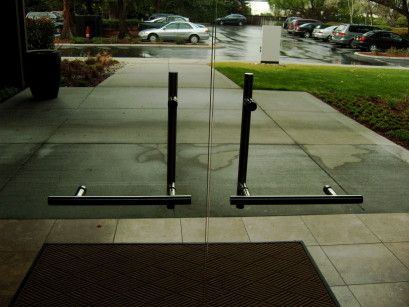
Without thinking, you put your hand on it like this, and push.  It opens!

When you're on the inside of the door, your natural reaction is to put your hand on it like this, and push.

The architects of the building had a perfect solution to the handle problem, so why did they use it on only half of the doors?

The architects of the building had a perfect solution to the handle problem, so why did they use it on only half of the doors?

Don Norman would not be amused.

Don Norman would not be amused.

I was going to put up a picture of a VCR or a microwave with a digital clock blinking “12:00” — the classic example of user interface failure.

But my microwave doesn’t blink “12:00”. It blinks “66:66”, or sometimes “6:66”, like it’s possessed by the devil. I think it has a short-circuited 6 key, so it’s processing nonexistent presses of the 6 key at random times. Sometimes it beeps loudly in the middle of the night. I keep it unplugged most of the time just to keep it quiet.

But anyway, the impossible-to-set digital clock is the classic example of user interface failure — and by “classic” I mean it was considered a hilarious punchline back in 1987: People were always saying “I’m so bad with technology, I can’t figure out how to get my VCR to stop blinking 12:00”. Ha ha ha. And what’s with airline food?

But the real problem was not that people in the 80s (or today) were “bad with technology”, it’s that VCRs (and microwaves) presented a terrible interface that made setting a digital clock far more difficult than setting an analog clock, and for no good reason!

And that’s why this blog is called “Not The User’s Fault”.

emacs-dialog-box

The Aquamacs “Save File?” dialog box has a ridiculous surplus of buttons.

Readers: How many buttons does this dialog box really need? (Answer below the fold.)

(more…)